Energy Use: Infographic

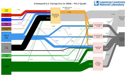
A rendering of energy flows in the United States in 2008. Lawrence Livermore Labs updates one of these each year.

Amazing and informative:

  1. The two strong correlations: oil-transportation, and coal-electricity.
  2. The huge amount of energy “rejected” due to transmission line loss, waste heat from light bulbs and power plants, inefficient vehicles, and so forth.
  3. The micro contribution of renewable sources.

From the Department of Who Knew:

  1. It’s called a Sankey diagram. Tufte made famous this Sankey flow chart drawn in 1869 by Charles Minard showing Napoleon’s disastrous march into Russia.
  2. Sankey diagrams have websites. Here’s one.
  3. One quad is equal to 8,007,000,000 gallons of gasoline, 36,000,000 tons of coal, or 252,000,000 tons of TNT.

Designing the world from scratch, what would your version of the energy flows look like?
Jump to link.

Comments

One Comment so far. Leave a comment below.
  1. Jeff B,

    More on the “rejected energy” bit:

    …look at the light and dark gray bars on the right side of the chart. The light gray represents lost or wasted energy, and the dark gray represents energy we actually use. Lawrence Livermore uses the term “rejected energy” for the energy that is lost and can’t be used.

    Yes, it’s true. We lose a lot more energy than we use. We lose massive amounts of electricity through leakage in the transmission grid, especially over long-distance power lines. We lose energy from petroleum through the heat in our car engines and the heat in our brakes (that lost braking energy is part of what the Toyota Prius reclaims for its batteries). In fact, a footnote at the bottom of the chart points out that end-use efficiency is estimated to be 80% for commercial, residential, and industrial uses, but only 25% for transportation uses.

    In 2009 we actually used over 39.9 quads of energy, but at the same time we lost 54.6 quads. In percentages, we used about 42.1% of the energy we generated and lost about 57.9% of it. Their term “rejected energy” seems far too bland for what this really represents.

    If you look at this another way, consider that our overall energy generation created roughly 5,814 million metric tons of carbon dioxide in 2008. Presuming our efficiency doesn’t change much from year to year, we generate more than 3,364 million metric tons of carbon dioxide each year generating energy we don’t even use. Similar percentages would apply to pollutants such as sulfur, ozone, nitrogen, particulate matter, and so many others. That is a visceral reminder of the cost of not becoming more efficient and sustainable.

    Efficient is good.

Add Your Comments