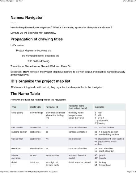
CD Sheet Index

From General to Specific – Discipline Prefix to Sheet Number

A surprise. The CSI Uniform Drawing System orders sheets differently than the AIA ConDoc system, following more strictly in the order in which a structure is constructed.

Quoting from the AIA white paper:

Guiding principles include the following:

  1. Segregating information by discipline (both design and construction) to form subsets of the total drawing package
  2. Ordering the subsets to correspond to the natural sequence of construction, closely associating disciplines where topics are similar
  3. Collecting and presenting each drawing (plan, elevation, section) on a sheet dedicated to that drawing type (though different drawing types may be combined for small projects)
  4. Presenting information within each subset from general to specific

Discipline PREFIX

Architects are used to seeing their stuff come first, but ordering the set by the “natural sequence of construction” is rational.

PrefixDiscipline
GGeneral
HHazardous Materials
VSurvey/Mapping
BGeotechnical
WCivil Works
CCivil
LLandscape
SStructural
AArchitectural
IInteriors
EEquipment
FFire Protection
PPlumbing
DProcess
MMechanical
EElectrical
TTelecommunications
RResource
XOther Disciplines
ZContractor/Shop Drawings
OOperations

Sheet TYPE

Within each discipline, sheets are always grouped by type.

PrefaceDescriptionUsage Notes
000Generalproject data
symbols
key notes
general notes
100Plansbuilding plans: minimum 1/4" scale
site plans come under the L series sheets
200Elevationsexterior building elevations
1/4" minimum scale
1/2" for tricky areas
300Sections, Wall Sections1/4" min
1/2" preferred
3/4" for wall sections min
400Scaled-up plans, Sections, or Elevations3/4"
500Details1 1/2" details
3" details
600Schedules and Diagrams
700User-definedtypical detail sheets
800User-definedtypes that do not fall into other categories
9003D representations3D representations
isometrics
photographs

Sheet NUMBERING

Sheets numbers are built from five components:

Discipline – Type – Sequence – Sequence Designator (optional) – Supplemental Designator (optional)

Which in general produces numbers that look something like:

A-102-01-R1

Discipline

Per the CSI table above

Type

Per the Sheet Types in the table above

Sequence

Easy stuff – just a number. The sequence starts with 01 (not 00) and proceeds to 99. Such as:

A-102

Suffix

For sheets added after a numbering sequence has been established, Suffixes can be used. Such as:

A-102-01

Supplemental

Designators indicate revised sheets. “R” indicates a partial revision. “X” indicates a totally revised sheet. Such as:

A-102-X1
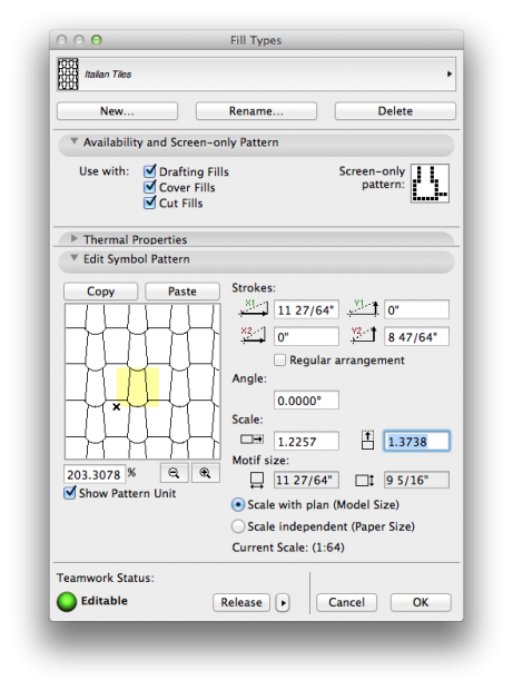
Buried Tolerance Toggle

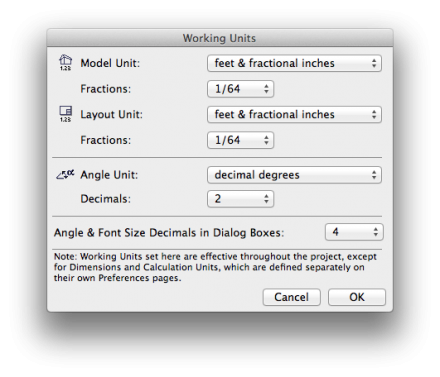
Stymied by lack of significant digits in library part, fill, or curtain wall dialog boxes?

The fix is a Preference: Angle and Font Size Decimals in Dialog Boxes.

fill dialog

working units

Game Rules

Safari013

Not how to play, nor how to play with style.
Rather, how to keep our stylish play in-bounds.

Link    2012 VUSBC

Link    2009 IBC Commentary  (No Virginia amendments)

Link    Charlottesville Current Codes and Design Criteria


Design criteria for our area – 2012 values

CategoryValue
Ground snow load30 psf
Wind speed 90 mph
Frost depth 18”
Seismic Design ClassB
WeatheringSevere
TermitesModerate/Heavy
Decay Region Slight/Moderate
Winter Design Temp16° F
Air Freezing Index273
Mean Annual Temperature56.8° F


Energy criteria for our area – 2015 residential values

Building ElementRequirement
Ceiling R-value49
Wood Frame Wall R-value15 or 13 + 5
Mass Wall R-value
when >50% of insulation is on the exterior of the wall
8
Mass Wall R-value
> 50% of insulation is on the interior of the wall
13
Floor R-value19
Basement Wall R-value
R-10 continuous on the inside or outside of the wall, OR
R-13 cavity insulation on the interior side of basement wall
10/13
Slab R-value10, 2ft
Slab R-value if heated15
Footing depth2 ft
Crawlspace Wall R-value10/13
Window U-Factor0.35
Skylight U-Factor0.55
All glazed fenestration SHGCNR
SHGC.4

World Builder

Prologue, Henry V:

But pardon, and gentles all,
The flat unraised spirits that have dared
On this unworthy scaffold to bring forth
So great an object: can this cockpit hold
The vasty fields of France? or may we cram
Within this wooden O the very casques
That did affright the air at Agincourt?

The Bard, with humility, his theater, the wooden “O” deemed “unworthy”, asks pardon for the effrontery of staging a bit of historical fiction there.

Oh, and what finds itself crammed within the spaces we architects to presume to make?

Life

Pardon us please for daring to set a stage and bring forth so great an object as living-in-the-world.

Are we sufficiently humble? Are we honoring the material? Is the scaffolding we have envisioned up to the task?

So, a film: on the one hand shot in a day, but on the other needing two years in post-production. For architects and film makers both, after the vision, comes the long work of documentation, and iterative refinement with digital tools.

Architects have always been world-builders. The work is best when motivated by affection.

0.352777778

A Postscript point is 0.352777778 of a millimeter, or 1/72 of an inch.

Our font size standard is 6-point, sometimes 7-point, type.

Therefore in those “helpful” dialogs asking how large you want your type to be in mm, enter the following:

size in pointssize in millimeters
62.11
72.46

Dimension Essentials

We admit the other dimension post here is completely over-wrought – not that you shouldn’t read it.

Meanwhile here’s a quick and effective how-to:

Humans

A nice how-to below: adding figures to a scene.

We’ve been having a long conversation with our photographer recently about human figures in architectural photographs and renderings, with that conversation spilling into our design studio as well.

In our view, human figures in an architectural rendering need to remain anonymous. We have previously intimated as much.

Bad examples of architectural presentations use human figures like candy sprinkles on a dessert that’s already too rich, or a liar who talks to much, or buildings that need signs to point out where the front door is. These things don’t help and are not fixes. Just stop.

We do want to see past the sprinkles and think about the scale of the architectural space proposed. We want the verisimilitude, the invitation to a possible future. We don’t want to be distracted by space invaders, thinking about who these people are, where they got their hair cut, or what they might be really thinking about.

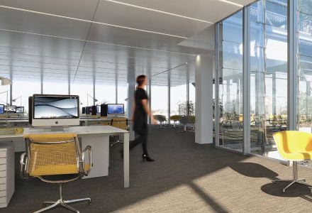
Which is why they often turn their backs on us.

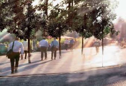
Or skulk in the trees.

Or move faster than the shutter speed – feeling safer behind the blur.

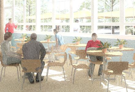
Or being ‘lonely in the modern world’ they quietly sigh and wait for us to finish the render.

Or try to quickly move out of the frame.

(N.B. The first three images above we think are pretty good. The last two technically excellent but alienating. Image one is Foster’s Apple campus. The others are all from the developer package selling Renzo Piano’s London Shard project. Mostly good, but some not. Here is an interesting, if scary, example, a scariness relieved only somewhat after reading about the particular and weird building brief, but, still.)

In seriousness, it has always been thus: creating a quality architectural rendering requires training the fine arts, knowledge of color theory, an intuition about perspective and composition, and an understanding of how to reinforce a narrative and communicate visually. In the digital present, days, it also requires the digital skills to correct the fall of light on a figure, to artfully anonymize it, the ability to properly add shadows and reflected light and to feather it into the scene. Even a quick plan sketch is a tangled network of choices of what to foreground and what to background given the intent of the drawing. A representation in three dimensional space more so.

And per the conversation referenced above, figures, people, models – call them what you will – and messaging gone off the rails are just as much a problem for architectural photographers, especially as the line between the photograph and the CGI becomes finer. We don’t want our figures to be made fun of. Oh no.

For Photoshop skills, look for some technical how-to in the video above – with plenty more where that came from. Keys to a beautiful visual narrative can’t really be put into a checklist or tutorial, although many have tried. Critique checklists are sometimes informative. The American Association of Architectural Illustrators has an annual competition – which you’d think one could learn a lot from, but to look at the latest publication there is surprisingly little there there.

The three images below grabbed off our boards, certainly aren’t polished perfection, but we like the speed with which they were created, and how strong a communication tool they are for informal design updates both within a design team and with our clients.


During design, at BDA we find it convenient to render figures directly within Artlantis and take advantage of quickly moving back and forth between active designing and reflective assessment. Post-processing to get the figures right makes for a less efficient workflow – but for important public-record renderings the figures certainly need to be “right”. Packaged 3d scalies or renderable 3d figures are almost never perfect out of the box, but they are perfectly adequate for scenarios where brisk efficiency is more important than perfect photo-realism, which in a busy small design office is… almost all the time. And often we don’t bother with figures at all, knowing that a space can speak for itself if the space is well-designed and well-presented.

Verisimilitude is a slippery slope. Figures can be semi-transparent in-motion ghosts, as in time-lapse photographs, or you can shoot for natural realism, raising the bar and your time commitment by an order of magnitude with the sudden need to get the lighting, palette, composition, composure, and emphasis right. Before you know it, you’re as wrapped up in the blocking as Raphael must have been when painting the School of Athens, although I think we’ll agree his intentions deviate a bit from the intentions of the typical twenty-first century architect rendering a scene.


As it has always been with architectural representation, the goal is to get to the point. Transmit the right message: what the space is like, how the light comes in, how it might feel to be there.

Antitesselationism

A skilled GDL scripter is capable of producing amazingly clean objects, but the catalog of clean GDL objects is not as deep as one would like it to be. (See the sidebar links here in bd-MAP for access to some of the GDL catalog.)

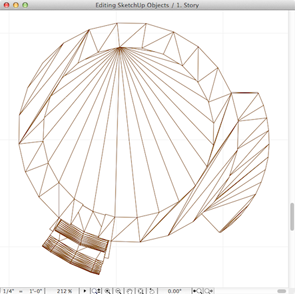
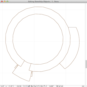
So we rely on third-party catalogs from time to time, but the objects are often polygon nightmares. AC 16 has a new tool and a new way to clean them up.

Clean is good.

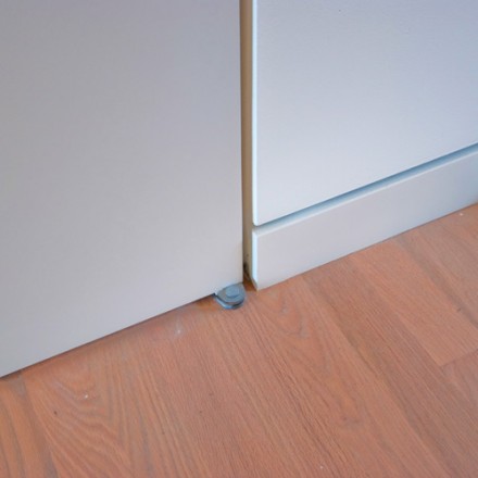
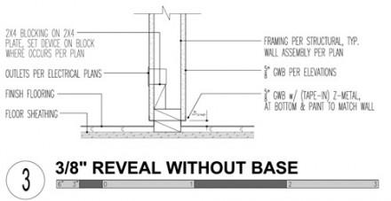
Modern Base Details

We talk about this detail a lot. Here’s another conversation.

Print Me

News: bd-MAP prints nicely now.

Geekery: The web is not designed for printing, and even as it is, Chrome browsers will not print the required background colors of tables. Firefox and Safari work nicely – just be sure “background colors” are enabled in the print dialog.