Tag artlantis

Humans

A nice how-to below: adding figures to a scene.

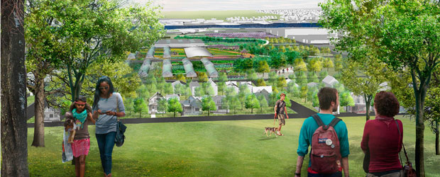
We’ve been having a long conversation with our photographer recently about human figures in architectural photographs and renderings, with that conversation spilling into our design studio as well.

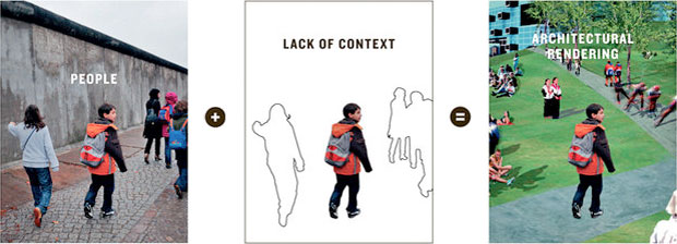
In our view, human figures in an architectural rendering need to remain anonymous. We have previously intimated as much.

Bad examples of architectural presentations use human figures like candy sprinkles on a dessert that’s already too rich, or a liar who talks to much, or buildings that need signs to point out where the front door is. These things don’t help and are not fixes. Just stop.

We do want to see past the sprinkles and think about the scale of the architectural space proposed. We want the verisimilitude, the invitation to a possible future. We don’t want to be distracted by space invaders, thinking about who these people are, where they got their hair cut, or what they might be really thinking about.
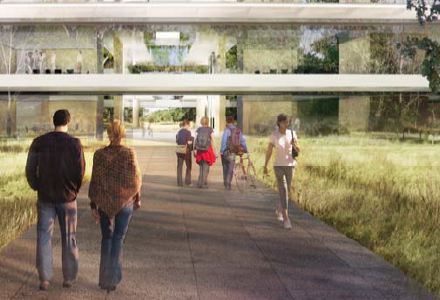
Which is why they often turn their backs on us.
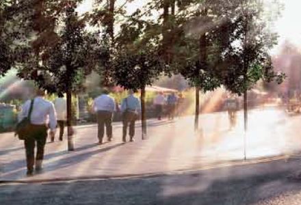
Or skulk in the trees.
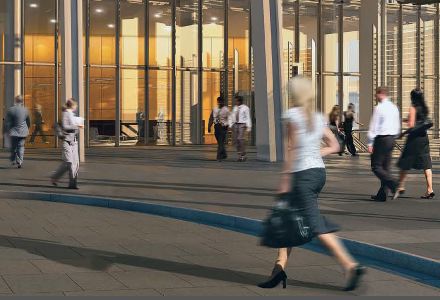
Or move faster than the shutter speed – feeling safer behind the blur.
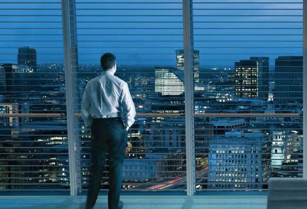
Or being ‘lonely in the modern world’ they quietly sigh and wait for us to finish the render.
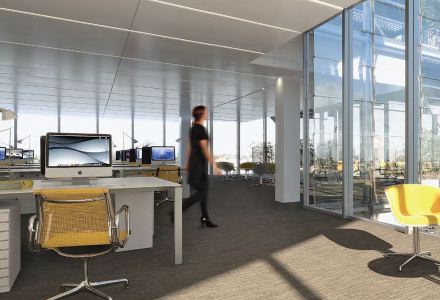
Or try to quickly move out of the frame.

(N.B. The first three images above we think are pretty good. The last two technically excellent but alienating. Image one is Foster’s Apple campus. The others are all from the developer package selling Renzo Piano’s London Shard project. Mostly good, but some not. Here is an interesting, if scary, example, a scariness relieved only somewhat after reading about the particular and weird building brief, but, still.)

In seriousness, it has always been thus: creating a quality architectural rendering requires training the fine arts, knowledge of color theory, an intuition about perspective and composition, and an understanding of how to reinforce a narrative and communicate visually. In the digital present, days, it also requires the digital skills to correct the fall of light on a figure, to artfully anonymize it, the ability to properly add shadows and reflected light and to feather it into the scene. Even a quick plan sketch is a tangled network of choices of what to foreground and what to background given the intent of the drawing. A representation in three dimensional space more so.

And per the conversation referenced above, figures, people, models – call them what you will – and messaging gone off the rails are just as much a problem for architectural photographers, especially as the line between the photograph and the CGI becomes finer. We don’t want our figures to be made fun of. Oh no.

For Photoshop skills, look for some technical how-to in the video above – with plenty more where that came from. Keys to a beautiful visual narrative can’t really be put into a checklist or tutorial, although many have tried. Critique checklists are sometimes informative. The American Association of Architectural Illustrators has an annual competition – which you’d think one could learn a lot from, but to look at the latest publication there is surprisingly little there there.

The three images below grabbed off our boards, certainly aren’t polished perfection, but we like the speed with which they were created, and how strong a communication tool they are for informal design updates both within a design team and with our clients.
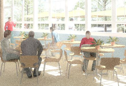
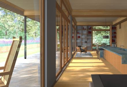
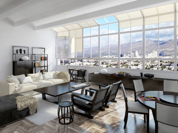
During design, at BDA we find it convenient to render figures directly within Artlantis and take advantage of quickly moving back and forth between active designing and reflective assessment. Post-processing to get the figures right makes for a less efficient workflow – but for important public-record renderings the figures certainly need to be “right”. Packaged 3d scalies or renderable 3d figures are almost never perfect out of the box, but they are perfectly adequate for scenarios where brisk efficiency is more important than perfect photo-realism, which in a busy small design office is… almost all the time. And often we don’t bother with figures at all, knowing that a space can speak for itself if the space is well-designed and well-presented.

Verisimilitude is a slippery slope. Figures can be semi-transparent in-motion ghosts, as in time-lapse photographs, or you can shoot for natural realism, raising the bar and your time commitment by an order of magnitude with the sudden need to get the lighting, palette, composition, composure, and emphasis right. Before you know it, you’re as wrapped up in the blocking as Raphael must have been when painting the School of Athens, although I think we’ll agree his intentions deviate a bit from the intentions of the typical twenty-first century architect rendering a scene.


As it has always been with architectural representation, the goal is to get to the point. Transmit the right message: what the space is like, how the light comes in, how it might feel to be there.
Jogging Past Environmentally Responsible Retail


Listening to their iPods in apartments that don’t exist yet, walking their dogs down prospective city streets, playing chess together in a forthcoming park near Potrero Hill.

Who are these little humans and what are they doing in our images? The New York Times and BLGBLOG looked into the question of human figures in architect’s renderings. We’re asking ourselves the same question

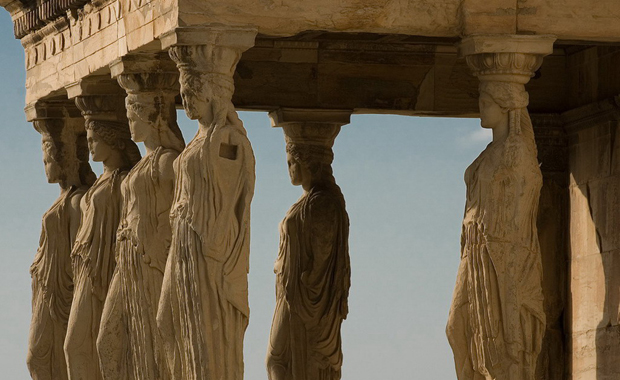
George Hershey’s The Lost Meaning Of Classical Architecture paints classical architectural motifs a color grounded in unpleasant realities: Sacrifice. Blood. Enslavement. After reading that book I never thought of the Caryatids the same way again, neither the little Dwarfs holding up the front of Michael Eisner’s office; both appear reasonably content holding the building up, but if you accept George Hershey’s line of argument, they are slaves pressed into service. Michael Graves should have known better.

Technology has changed, but it seems we may have come full circle.

The ancients with incredible skill chiseled the image and likeness of humans from a block of stone and deployed the resulting figure into the service of their building.

And today it is a bit the same except we capture them from the digital ocean. It’s nice when Anderson Cooper or Angelia Jolie or underprivileged families will hang around well… forever and legitimize and tart up ones sales pitch for a project, and hopefully the pitch places it above critique, as the project is apparently already an essential part of the city.

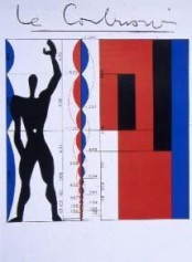
I think there was a post-classical, pre-digital phase when human figures transcended a particular time and place and stood for all humans in all places, since they didn’t sport recognizable backpacks or fashion accessories or haircuts. All are descendants of da Vinci’s Vitruvian Man, and I’m thinking of Le Corbusier’s modulor figure, or WG Clark’s beautiful ink drawings for Robert Venturi, and other mid-to-late century examples of where, in Corb’s case anyway, the figure was anonymous and functioned as a humanistic ruler to make a point about the building’s proportion or scale. These days we release our scalies into virtual architectural terrariums and hope they will be happy there.

I can’t really add much to the coverage cited above, and I encourage you to have a look at the NYT piece.

In a lighter vein (or maybe not) there’s this:

Lighting a Scene

Don’t confuse lighting design for still images or stage with lighting design for an architectural project. Related? Yes. Both important? Yes. Different? Yes.

Dwight Atkinson, a good architectural educator and writer about ArchiCAD-Artlantis workflows, says flat out that the only effective workflow in Artlantis is to think like a Director of Photography and light your scene accordingly. The basic technique is called three-point lighting, the three points, or lights, being

  1. the key light
  2. the fill light, and
  3. the back light.

So by way of a practical example see the lighting professional’s tutorial below. Videography is not our trade. Yet we share the videographer’s design sensibilities, and understand what it means to fret about foreground, background, contrast, highlighting, balance, presentation, and nuance, always, of course, with a goal of presenting subject material (in this case, a speaking person on film) as effectively as possible.

The lighting technical director at Pixar has written a book. I’m sure we should read it. But until we get around to that, an equally effective learning experience might be some quality time meditating on the image at the head of this post, painted between bar fights by Caravaggio in 1594. He was 23 years old.

It would be incorrect to say Caravaggio invented these principles of lighting, but he was certainly one of the first artists to effectively capture them, in hardcopy rising to the level of Art.

I offer the moonlight grazing the wing of the angel cradling St. Francis, and rest my case.

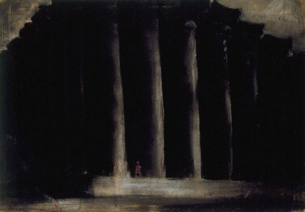
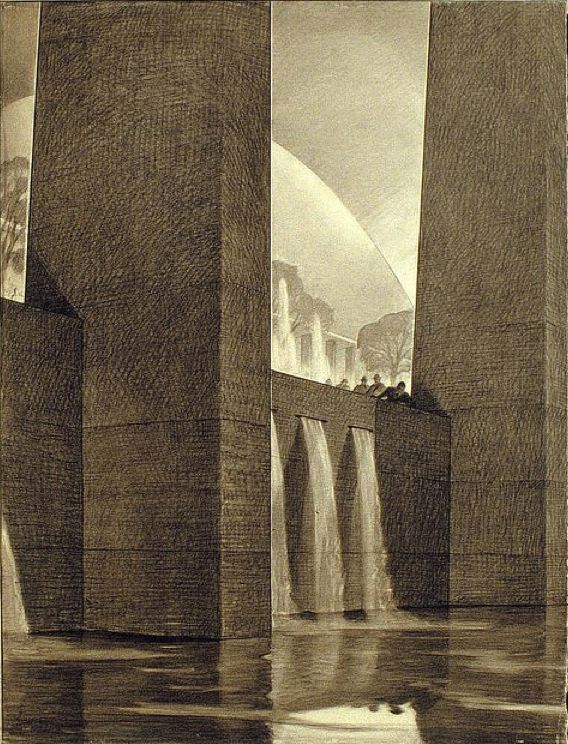
Closer to home, Hugh Ferriss‘s work also evidences a deep appreciation of foreground and background. I’m convinced he learned a thing or two from Caravaggio. Pugilistic affinities aside, you couldn’t ask for a better teacher.

Truth or Fiction

A meditation on the architectural image: photograph? rendering? You decide.

In the nineties I remember the minor kerfuffle involving an image of the interior of the not-yet-open-to-the-public MOMA in San Francisco by Mario Botta, until it was revealed that the image was not the illicit pre-grand-opening photograph captured by a ninja photographer people thought it was, but rather a digital model rendered with great care. I couldn’t find a specific link to verify my memory, but the images of SFMOMA here certainly fit the “is it real?” meme.

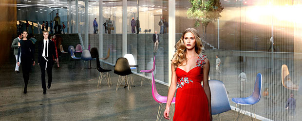
There are exceptions, but almost every photorealistic rendering I look at seems to lack a point other than “hey look at me and my shallow command of texture map and lighting effect.” The technology amazes, but let’s remember why Avatar was not such a good movie, and why Pixar seems incapable of making a bad one, and what architecture is for, and the reason we’ve decided to spend our lifetimes making buildings. Stealing the conceit from the Avatar link above: a CGI image is distracting like incredibly good-looking people are (the stereotypical fashion model) until you realize how vapid and self-centered and boring it is. And like incredibly good-looking people who mange to also be interesting, smart, and compassionate – CGI that *does* jump the gap between documentation and art has an uphill fight to prove its worth.

These are the same issues photography faces as an art form.

There’s a point to be made here that I’ll cite with reference to Robert Bringhurst, the typographer, poet and writer: this visual material is at its best when it self-effacingly serves the (architectural) content.

Referencing what the poet said: a rendering should be window, opening a view through to something vital.

So what’s that point again? I don’t know… perhaps it is to say that just because one can, does not mean one should. Or better: if you can, don’t forget to ask yourself why and to what effect?

Vermeer is still the gold standard.