But pardon, and gentles all,
The flat unraised spirits that have dared
On this unworthy scaffold to bring forth
So great an object: can this cockpit hold
The vasty fields of France? or may we cram
Within this wooden O the very casques
That did affright the air at Agincourt?
The Bard, with humility, his theater, the wooden “O” deemed “unworthy”, asks pardon for the effrontery of staging a bit of historical fiction there.
Oh, and what finds itself crammed within the spaces we architects to presume to make?
Life
Pardon us please for daring to set a stage and bring forth so great an object as living-in-the-world.
Are we sufficiently humble? Are we honoring the material? Is the scaffolding we have envisioned up to the task?
So, a film: on the one hand shot in a day, but on the other needing two years in post-production. For architects and film makers both, after the vision, comes the long work of documentation, and iterative refinement with digital tools.
Architects have always been world-builders. The work is best when motivated by affection.
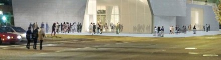
We’ve been having a long conversation with our photographer recently about human figures in architectural photographs and renderings, with that conversation spilling into our design studio as well.
In our view, human figures in an architectural rendering need to remain anonymous. We have previously intimated as much.
Bad examples of architectural presentations use human figures like candy sprinkles on a dessert that’s already too rich, or a liar who talks to much, or buildings that need signs to point out where the front door is. These things don’t help and are not fixes. Just stop.
We do want to see past the sprinkles and think about the scale of the architectural space proposed. We want the verisimilitude, the invitation to a possible future. We don’t want to be distracted by space invaders, thinking about who these people are, where they got their hair cut, or what they might be really thinking about.
Which is why they often turn their backs on us.
Or skulk in the trees.
Or move faster than the shutter speed – feeling safer behind the blur.
Or being ‘lonely in the modern world’ they quietly sigh and wait for us to finish the render.
Or try to quickly move out of the frame.
(N.B. The first three images above we think are pretty good. The last two technically excellent but alienating. Image one is Foster’s Apple campus. The others are all from the developer package selling Renzo Piano’s London Shard project. Mostly good, but some not. Here is an interesting, if scary, example, a scariness relieved only somewhat after reading about the particular and weird building brief, but, still.)
In seriousness, it has always been thus: creating a quality architectural rendering requires training the fine arts, knowledge of color theory, an intuition about perspective and composition, and an understanding of how to reinforce a narrative and communicate visually. In the digital present, days, it also requires the digital skills to correct the fall of light on a figure, to artfully anonymize it, the ability to properly add shadows and reflected light and to feather it into the scene. Even a quick plan sketch is a tangled network of choices of what to foreground and what to background given the intent of the drawing. A representation in three dimensional space more so.
And per the conversation referenced above, figures, people, models – call them what you will – and messaging gone off the rails are just as much a problem for architectural photographers, especially as the line between the photograph and the CGI becomes finer. We don’t want our figures to be made fun of. Oh no.
For Photoshop skills, look for some technical how-to in the video above – with plenty more where that came from. Keys to a beautiful visual narrative can’t really be put into a checklist or tutorial, although many have tried. Critique checklists are sometimes informative. The American Association of Architectural Illustrators has an annual competition – which you’d think one could learn a lot from, but to look at the latest publication there is surprisingly little there there.
The three images below grabbed off our boards, certainly aren’t polished perfection, but we like the speed with which they were created, and how strong a communication tool they are for informal design updates both within a design team and with our clients.
During design, at BDA we find it convenient to render figures directly within Artlantis and take advantage of quickly moving back and forth between active designing and reflective assessment. Post-processing to get the figures right makes for a less efficient workflow – but for important public-record renderings the figures certainly need to be “right”. Packaged 3d scalies or renderable 3d figures are almost never perfect out of the box, but they are perfectly adequate for scenarios where brisk efficiency is more important than perfect photo-realism, which in a busy small design office is… almost all the time. And often we don’t bother with figures at all, knowing that a space can speak for itself if the space is well-designed and well-presented.
Verisimilitude is a slippery slope. Figures can be semi-transparent in-motion ghosts, as in time-lapse photographs, or you can shoot for natural realism, raising the bar and your time commitment by an order of magnitude with the sudden need to get the lighting, palette, composition, composure, and emphasis right. Before you know it, you’re as wrapped up in the blocking as Raphael must have been when painting the School of Athens, although I think we’ll agree his intentions deviate a bit from the intentions of the typical twenty-first century architect rendering a scene.
As it has always been with architectural representation, the goal is to get to the point. Transmit the right message: what the space is like, how the light comes in, how it might feel to be there.
A single 22.5 m x 8.2 m x 60 cm acrylic glass panel at the aquarium in Okinawa. OK – sure – a Dubai aquarium has a slightly larger panel measuring 32.8 m x 8.3 m x 75 cm. One hundred and seven feet long. Thirty inches thick. Thirty feet high. 270 tons.
How?
The video will calm us down (please: full screen, HD) while we ponder the impossible logistics of moving around such an object and installing it in a building. Without leaks.
We appreciate the twenty or thirty thousand creatures living here all the more, after pondering this, raising more important questions, I think, than how did they get the glass in.
Design aphorisms, humor, tiger mothers, and honesty don’t often travel together so I’m happy to recommend a piece by Michael Bierut based on that unlikely ensemble alone. The piece is also a memoir and tribute, of sorts, to Michael Bierut’s first boss Massimo Vignelli.
Which takes me back. Massimo Vignelli did all the graphic design for my first employer in New York, Eisenman/Robertson. The graphic ephemera of the firm designed by him, from file folders to letterhead and communication forms to the printed condoc sheets on which we drew everyday, evidenced that certain Vignelli something. Classy and professional, his work made our little eight-person office look good.
Not until years later did I discover the ground rules behind Vignelli’s work:
Semantics
Syntactics
Pragmatics
Discipline
Appropriateness
Ambiguity
Design is One
Visual Power
Intellectual Elegance
Timelessness
Responsibility
Equity
At E/R you could see Vignelli’s design rules floating up off the printed stuff, and it made an indelible impression.
Michael’s piece addresses the unwritten rules in his office and how working for someone with such a strong sense of aesthetic right and wrong affected his growth as a designer.
Indulge my walk down memory lane and watch this video of my two old bosses in an interview with some C-ville shout-outs. Pure Jacque and Peter. Working at E/R was a great experience, always interesting.
A FULL-CG animated piece that tries to illustrate architecture art across a photographic point of view where the main subjects are already-built spaces. Sometimes in an abstract way. Sometimes surreal.
Credits:
Alex Roman
Modeling – Texturing – Illumination – Rendering
Music Sequencing & Orchestration
Mixing (Sonar & EWQLSO Gold Pro XP)
Sound Design
Post production & Editing
Based on original scores by
Michael Laurence Edward Nyman. (The Departure)
Charles-Camille Saint-Saëns. (Le Carnaval des animaux)
Directed by Alex Roman
Made with 3dsmax, Vray, AfterEffects and Premiere.
“The quality of a map is also in part an aesthetic matter. Maps should have harmony within themselves. An ugly map, with crude colors, careless line work, and disagreeable, poorly arranged lettering may be intrinsically as accurate as a beautiful map, but it is less likely to inspire confidence.”
John K. Wright
bd-MAP
bd-MAP documents process standards, ideas, and information at Bushman Dreyfus Architects in Charlottesville, Virginia.