November 2011
Mon Tue Wed Thu Fri Sat Sun
 123456
78910111213
14151617181920
21222324252627
282930  

Month November 2011

The Poet on Glass Architecture

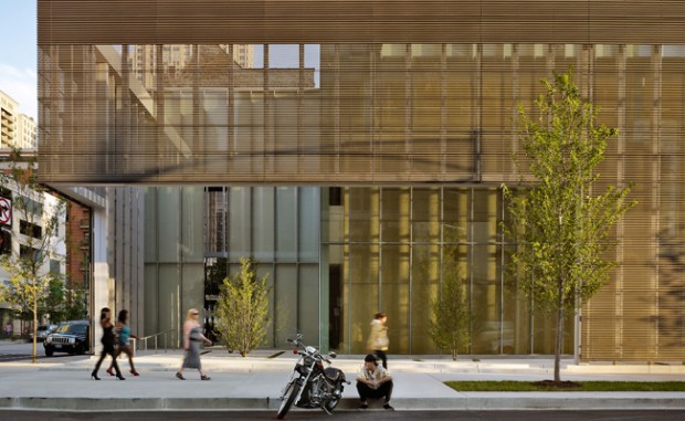
Billy Collins, US Poet Laureate, speaking about the beautiful Poetry Foundation in Chicago, takes a moment to make a general point:

A lot has been said about poetry and architecture, but usually that’s just a metaphor; it means architecture is like poetry in the same way as you’d say something is poetry in motion. [The Architect of the Poetry Foundation] did say that he wanted to construct this building as a kind of a parallel to a poetic experience. One thing about the building is that it’s basically glass, and you might say there are two kinds of poetry: One is stained glass, and one is clear glass. Stained glass poetry wants to be very decorative and colorful and have a brilliant surface, and the poetry I prefer is the poetry of glass, which is clear and makes you want to see through it to something vital. It’s true that as you walk through the building you get many angles from which to look at the interior of the building. So if you walk 25 or 30 feet in some direction and turn around, you are seeing an entire reconfiguration, and that is actually a quite accurate physical representation of what a poem does.

John Ronan, the architect, has delivered quite a nice job: the perforated screen changes color in the sun, special aggregates warm up the sandblasted concrete, the layers of onion-skin architecture work together well, you feel the presence of a well-thought-through syntax. This is an interesting project for a historically struggling starving-artist nonprofit as it grapples with what to do with a huge philanthropic gift, one of the results of which is this building.

This work is as much about the veil, as it is the glass, which makes me think the Audubon Society would approve.

More on John Ronan and the building, and the Poetry Foundation. This page has a link to renderings by the designers and photographs of the opening reception.
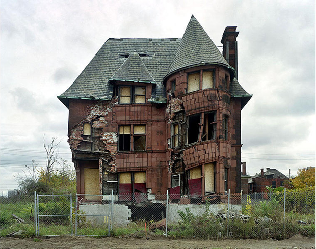
Ruins of Detroit

We’re surrounded by an embarrassment of rich photography.

Framing Plans: General

Rules for framing plans.

A framing plan shows the following:

  1. The framing for the floor of the current story
  2. The load paths of the current story, in black (load-bearing walls, columns, etc).
  3. Supporting walls below the current story
  4. Partitions of the current story, in gray
  5. Plumbing, mechanical, and electrical fixtures that need to be coordinated with the structure, in gray
  6. Dimensions associated with the framing
  7. Layout lines, grid lines, and work lines (a structural grid if you’re using one, otherwise centerlines and alignments communicating design intent).
  8. Detail cross-references to framing and foundation details, and building sections.

Method

  1. Beams and girders. Model them on layer S-frmg.
  2. Joists and rafters. Represent them on the framing plan with 2-d fill 06 | Framing 16 and related fills, on layer S-frmg-2. If you need other spacings, just make another fill. Repetitive members of a floor or roof can be modeled for other reasons, (3d framing diagrams, sections and details) but we don’t typically use the modeled joists and rafters for the framing plan. Why? Because it is far easier and faster to symbolically indicate repetitive framing than to model it accurately enough for use in a floor plan.
  3. Dimensions: Indicate control points – where to start 16″ o.c. spacings.
  4. Partitions. No fill, separators shown.
  5. Bearing Walls. To show a bearing wall, draw a fill on top of it. This is a non-associated, additional element on layer +S-note.
  6. Annotations.
    1. All annotations should go on the layer +S-note.
    2. If you want an annotation to show in the foundation plan simultaneously, use +S-note-all.
    3. Use a background of pen 91 on text blocks to make them readable when placed on fills.
    4. Structure Notes. General notes such as loads, criteria, etc. are part of the General Notes PDF. Specific notes are added to the plans using text blocks.

Truth or Fiction

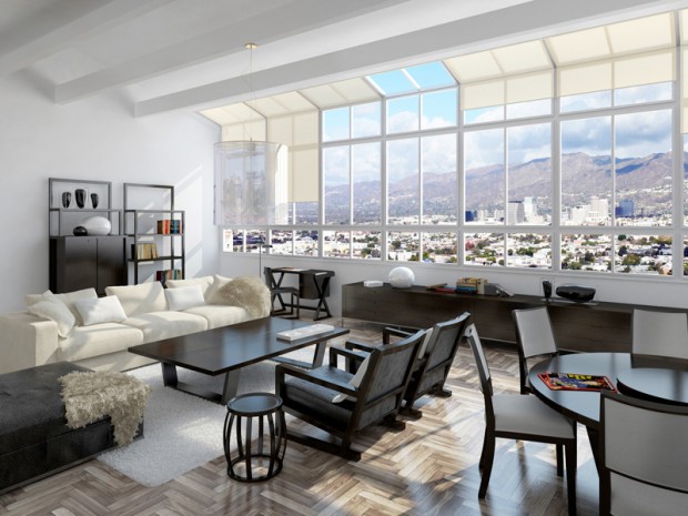
A meditation on the architectural image: photograph? rendering? You decide.

In the nineties I remember the minor kerfuffle involving an image of the interior of the not-yet-open-to-the-public MOMA in San Francisco by Mario Botta, until it was revealed that the image was not the illicit pre-grand-opening photograph captured by a ninja photographer people thought it was, but rather a digital model rendered with great care. I couldn’t find a specific link to verify my memory, but the images of SFMOMA here certainly fit the “is it real?” meme.

There are exceptions, but almost every photorealistic rendering I look at seems to lack a point other than “hey look at me and my shallow command of texture map and lighting effect.” The technology amazes, but let’s remember why Avatar was not such a good movie, and why Pixar seems incapable of making a bad one, and what architecture is for, and the reason we’ve decided to spend our lifetimes making buildings. Stealing the conceit from the Avatar link above: a CGI image is distracting like incredibly good-looking people are (the stereotypical fashion model) until you realize how vapid and self-centered and boring it is. And like incredibly good-looking people who mange to also be interesting, smart, and compassionate – CGI that *does* jump the gap between documentation and art has an uphill fight to prove its worth.

These are the same issues photography faces as an art form.

There’s a point to be made here that I’ll cite with reference to Robert Bringhurst, the typographer, poet and writer: this visual material is at its best when it self-effacingly serves the (architectural) content.

Referencing what the poet said: a rendering should be window, opening a view through to something vital.

So what’s that point again? I don’t know… perhaps it is to say that just because one can, does not mean one should. Or better: if you can, don’t forget to ask yourself why and to what effect?

Vermeer is still the gold standard.